
Making your podcast RSS feed look good in the browser
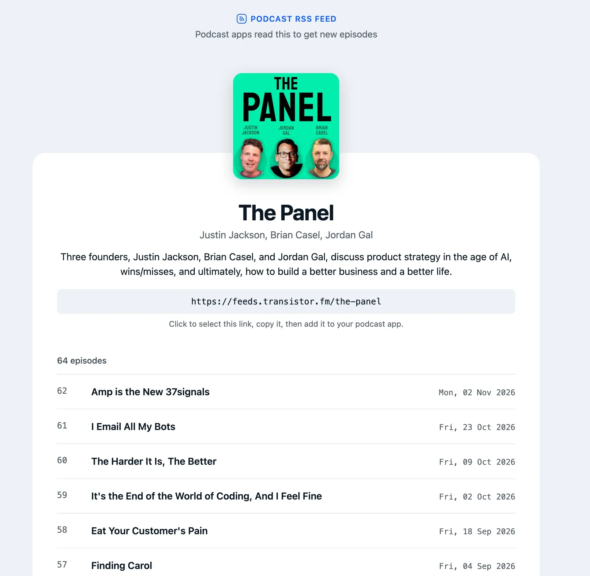
When someone opens your podcast's RSS feed in a web browser, they now see a clean page with your cover art, show description, feed URL, and a list of your episodes. There's a dark mode, too.
Why this changed
For years, Transistor used XSLT to turn feeds into readable web pages. It meant a listener who clicked your feed link saw your show instead of a wall of code. I wrote about why that matters in Don't kill my pretty RSS feed.
Chrome is removing XSLT support this month, and it has already started showing a warning banner on feeds that use it:
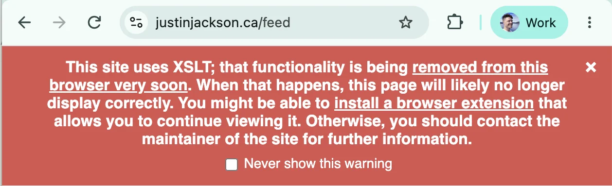
Customers saw that banner and assumed their feeds were broken. So we switched to a CSS stylesheet, which browsers still support. That idea came from James Cridland at Podnews.
John Spurlock saw the first iteration and encouraged us to up our styling game. "I've always associated Transistor with good design," he said, "I think you can do better."
Fair point! We went back and rebuilt it.
What's new
- A clear label at the top explains that this is a podcast RSS feed and that podcast apps read it to get new episodes.
- Your cover art, title, hosts, and description front and center.
- Your feed URL in a box, with a short note telling people to copy it into their podcast app.
- Your episode list, with episode numbers, titles, and publish dates.
- Dark mode that follows the viewer's system setting.
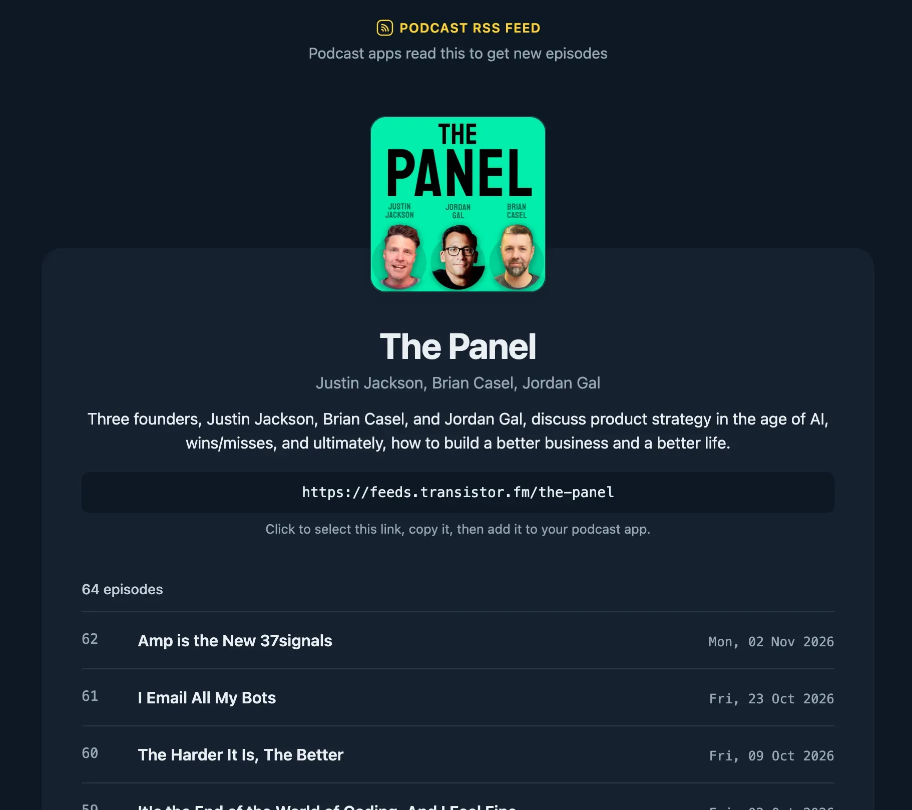
It's all CSS, so nothing in your feed changes for Apple Podcasts, Spotify, or any other app. CSS can't add an audio player the way XSLT could, so if you want people to listen in the browser, send them to your podcast website instead.
This is live on every Transistor RSS feed now!